Naturally, there are differences: Whereas “I Love︎ NY’ became a landmark—as evocative and beloved as the Chrysler Building—Pepsi’s logo remains a trademark, and as trade shifts, these marks evolve. Indeed, many consumers can age themselves by their childhood Pepsi logo.
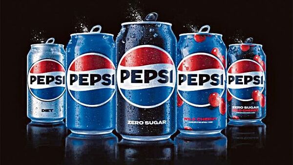
Of course, how brands evolve is everything. Inevitably Pepsi’s new in-house design, the first in 14 years, “pays homage to the brand’s rich heritage while taking a big leap toward the future”—as most big-brand rebrands do, or claim to. But of Pepsi’s various novelties, four stand out:
One, the reincorporation of ‘Pepsi’ into the logo’s heart. This is a decisive rejection of the 2008 rebrand, where the wordmark floated free from the icon, positioning Pepsi as a ‘hero brand’ recognizable without text. While this tech-inspired look tended to the bland, it did allow for clever blending campaigns, like the cheeky fast-food hijack from 2021. To my eye, the typography of Pepsi’s new wordmark is a little awkward: The ‘P’ is too squat, the ‘E’ is too thick, and the top of the ‘I’ is oddly slanted. That said, it’s bold and punchy, and will stand out more starkly on digital and social platforms, which is more than half the battle nowadays.
Two, Pepsi’s rejection of the flat globe logo and re-adoption of a rippling tricolour flag that ran from 1950 until 2007. Such a return rewards consumer familiarity and taps the sort of nostalgia harnessed by brands like Burger King and Warner.
Three, the introduction of two new colours: electric blue for Gen-Z-enticing “contrast, vibrancy, and… a contemporary edge”, and black, which, by appropriating the semiotics of zero-sugar packaging from Pepsi, Coke and Sprite, allows the brand to imply a wider ‘commitment’ to health. Just as ‘zero’ is the new ‘diet’ in the world of Big Soda, so aspartame is the new black. Pepsi’s chief marketing officer, Todd Kaplan, said: “A lot of people don’t even notice the black is there. It’s an intentional colour we added in with Zero Sugar, which will be the lead brand we use marketing. [Black] can act as a master brand statement.”
Four, the creation of a dynamic ‘pulse’ to associate the brand with Gen-Z-pleasing movement and music. Expect to see the logo “ripple, pop and fizz” in TV ads and on social media as Pepsi’s brand identity becomes ever more dynamic.
So far, so good. Pepsi’s rebrand is on-brand and on-point: It feels crisp and contemporary, harnessing a back-to-the-future brashness that mirrors fashion and befits a 125-year-old drink. It’s a world away from PepsiCo’s 2009 redesign of Tropicana, which, alongside Gap’s 2010 debacle, set a new low for branding disasters.
Yet, for all its apparent confidence, the press release Pepsi issued to promote its rebrand used the word “unapologetic” five times—including this from the chief marketing officer: “We couldn’t be more excited to begin a new era for Pepsi, as this exciting new and modern look will drive brand distinction to show up bigger and bolder and help people find new ways to unapologetically enjoy the things they love.”
What might prompt such defensiveness? It seems likely that Pepsi is gearing up for war on two fronts.
First, the threat from government intervention and the rise of ‘soda taxes’. According to the World Health Organization, at least 85 countries enforce some form of levy on sugar-sweetened beverages and according to a 2022 Gallup poll, 59% of adults across Colombia, India, Jordan, Tanzania and the US support higher taxes on high-sugar drinks. Although the impact of sugar taxes is complex and disputed, the tens of millions of dollars that Big Soda spends opposing their introduction speak volumes as to the risk they pose to profits.
The second front strikes at the heart of Pepsi’s identity, for 2023 is not just the 125th anniversary of the cola’s creation, it marks 60 years since the invention of the ‘Pepsi Generation’. In 1984, this classic tagline was ‘The Choice of a New Generation’. And then, in 1997, ‘Generation Next’. But at every stage, Pepsi has striven to be at the vanguard of generational fashion and aspiration. And then along comes Gen-Z, with its distrust of big business, its dislike of sugar, its focus on health and its fascination with (seemingly) authentic brands.
And so, while Pepsi’s “new and modern look” is indeed an attempt to “begin a new era” and “drive brand distinction,” it’s also likely something else. When sodas and fast food are regularly referred to as “the new tobacco” and when the taste of a new generation is now fixated on well-being, one can see why deploying black sugar-free semiotics and dynamic Gen-Z pulses is both an ‘exciting’ brand direction and an expedient brand distraction.
Ben Schott is Bloomberg Opinion’s advertising and brands columnist.
Download The Mint News App to get Daily Market Updates.
More
Less
#Pepsis #redesign #exercise #takes #GenZ #challenge
